OS X 10.7 Lion: my thoughts
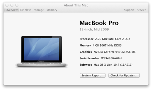
My first OSX upgrade went well I think. My MacBook Pro is a Mid 2009 model, as the nice new About This Mac (not sure why this is capitalised but never mind) tells me.

Ive never upgraded a Mac before since my pride and joy came with Snow Leopard installed, the as-of-then most up to date operating system so I had no idea what to expect. Ive been using my Mac for nearly two years now but before that I was a pretty heavy Windows user. My other tipple is Linux, so whatever it was like I was going to be tense and anxious.
Upgrading
Initially, meeting my expectations almost exactly, the progress bar was stuck on 33 minutes remaining. Big surprise I thought so I did some googling and realised that there was a menu bar present at the installer screen. This is different I thought, and one of the forums I read mentioned viewing the install log.
TIP: During the install, mouse over where the menu should be and click on Window - Show Log, or press ⌘L
This saved my install and my sanity! I could see what the install process was doing. It was continuing luckily and after probably more than an hour - a lot more than the 33 minutes it originally predicted - I booted into a swish new Lion computer. Bonus marks here to Apple for making the install screen interactive and not just telling people about the exciting new things coming from the operating system.
I did get a bit of a Windows pang when a whole host of screens popped up asking me to update this or remove that. Coupled with the Spotlight indexing that takes place rather extremely after the first boot, the system felt quite slow. Happily this sluggishness went away after a few minutes of leaving it alone so this is what I suspect all the claims of poor performance are based on. Typical internet users rushing to conclusions
New features
I am getting used to the natural scrolling direction, not sure whether Id actually call it natural especially since quite a lot of the time I use the mouse so iOSs scrolling direction doesnt make as much sense, but I heard some reports saying stick with it and it may become second nature, which seem to be true. I do like the fact that you can resize windows from any edge, a feature missing from Snow Leopard.
Auto-restore is a feature probably designed with people who use word processors a lot in mind. When you close a document, OSX will re-open the closed windows next time you start the app. This works well for Pages or Word, but for example my LaTeX editor TeXShop would reopen with many many windows of the last document I was working on. This got a bit repetitive since there were (just counting…) 17 files, all of which would open when I start TeXShop. I might disable this feature.
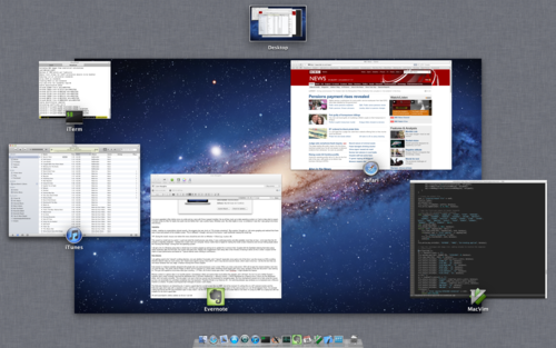
Mission control is a genius idea in my humble opinion. Considering I didnt use spaces that much before the upgrade, and I still dont, for me it is just a better Exposé. I instantly (and I mean instantly) removed the dashboard from it (System Preferences - Mission Control - Show Dashboard as a Space) since I never use the dashboard either, and it all works smoothly. The only gripe I can see is that you cannot use the keyboard for navigating apps. My linux background caused me to hate using the mouse as linux can essentially be controlled completely from the keyboard. Therefore ⌘-tab is my friend (or ⌘-~ for switching between app windows) so no keyboard use in Mission Control is a shame. Im pretty sure Exposé had it (though of course I cant check).

The fullscreen feature is an interesting one, it seems a good idea for a small screen like my MBP, but at the moment Im writing this on a 24 external monitor and the fullscreen apps dont work with a separate screen, and they just seem huge! I generally prefer to have apps on the same screen so I can ⌘-tab between them, for example coding and having the API documentation open in easy reach. I do like the idea of having for example full screen Mail or iCal when im using my MBP as a laptop but with two screens its not such a good idea.
Oh and Launchpad is utterly useless as far as I can tell.
Conclusions
Generally using my MacBook Pro has been a joy since the upgrade, everything runs well and definitely not slower than it used to. After having altered it to my liking, I have very similar performance and features than I used to have.
So why upgrade if youve just tried to recreate Snow Leopard I hear you cry?
Well there are some behind the scenes features that I like (the new style is much more subtle for example), and some obvious ones (Mission Control is definitely a plus) that have really made it worthwhile. I havent been able to investigate the fullscreen feature of apps since Ive mostly been using my external monitor but when Im on the move Im sure it will help a lot.
Considering the price (~£20 in the UK) its very much worth the upgrade.